Image by Socio Design
We’ve shared some great blogs on packaging design using paper and were so inspired by some of the designs that we thought we’d show you our top ten.
Amazingly we’ve found a bit of a trend for using craft papers and coloured and textured papers in artisan foods and goods especially luxury candles, tea, soaps and chocolate.
The look and feel of artisan paper clearly conveys the exclusivity and the “handmade” element of these luxury goods. Whether choosing a pastel or vibrant colour palette, in general, the trend follows a two colour design with classic fonts and scripts.
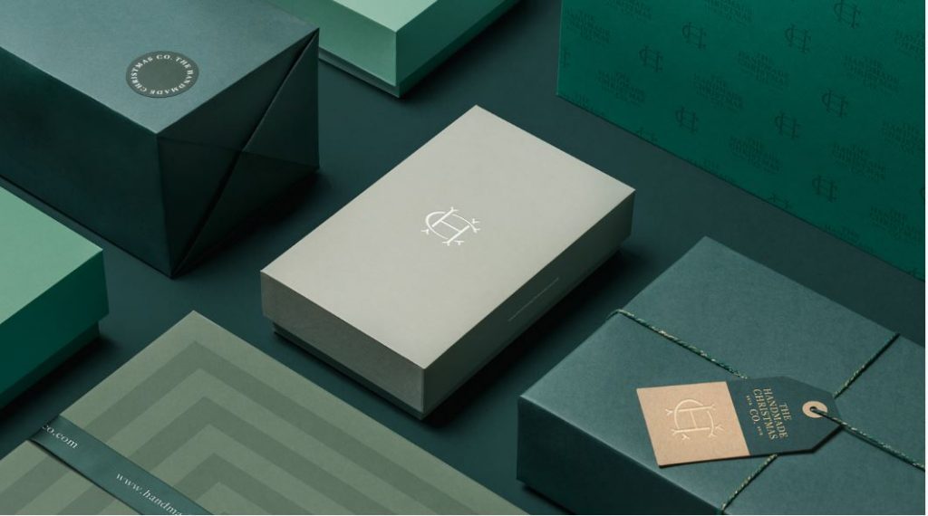
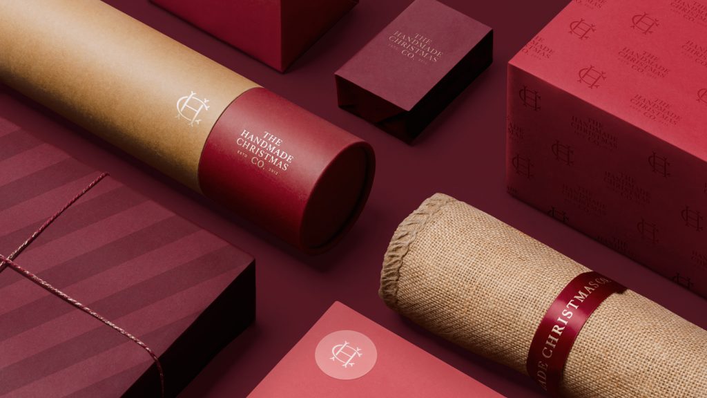
The Handmade Christmas Co
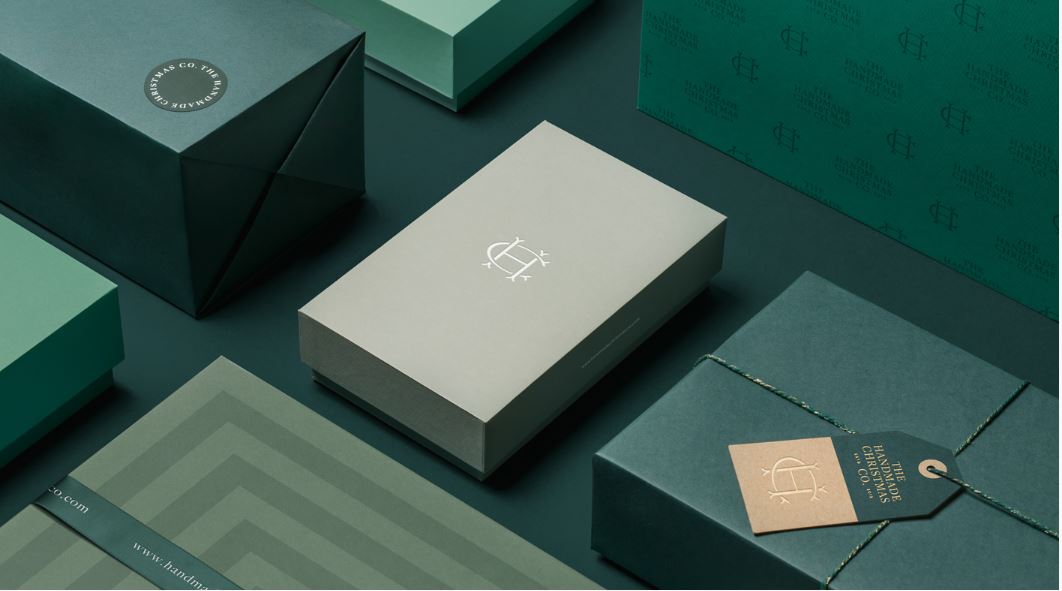
A perfect example of how coloured papers can be used to evoke a feeling or connection with the buyer, are the packaging designs from The Handmade Christmas Co. Designed by London agency Socio Design, the classic colour palette gives an air of exclusivity and their matching accessories such as cotton twine and traditional printed one colour tags give a hint of the quality handmade item inside.
Image by Socio Design
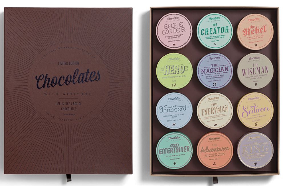
Chocolate with Attitude
If it’s chocolate – then it’s got to be good! We love the retro feel of the outer box, one colour print as mentioned before and when you open it you’re wowed by the 12 individual boxes with chocolates inside. It’s beautiful to behold. The time, effort and thought behind the packaging echoes the handmade chocolates inside. Scrummy.
Image by Chocolates with Attitude via Behance
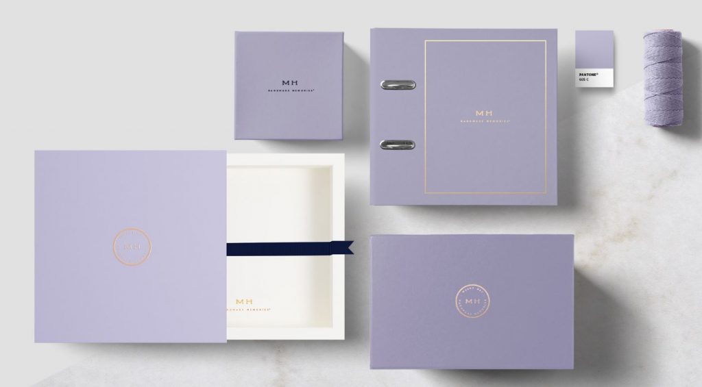
MH – Handmade Memories
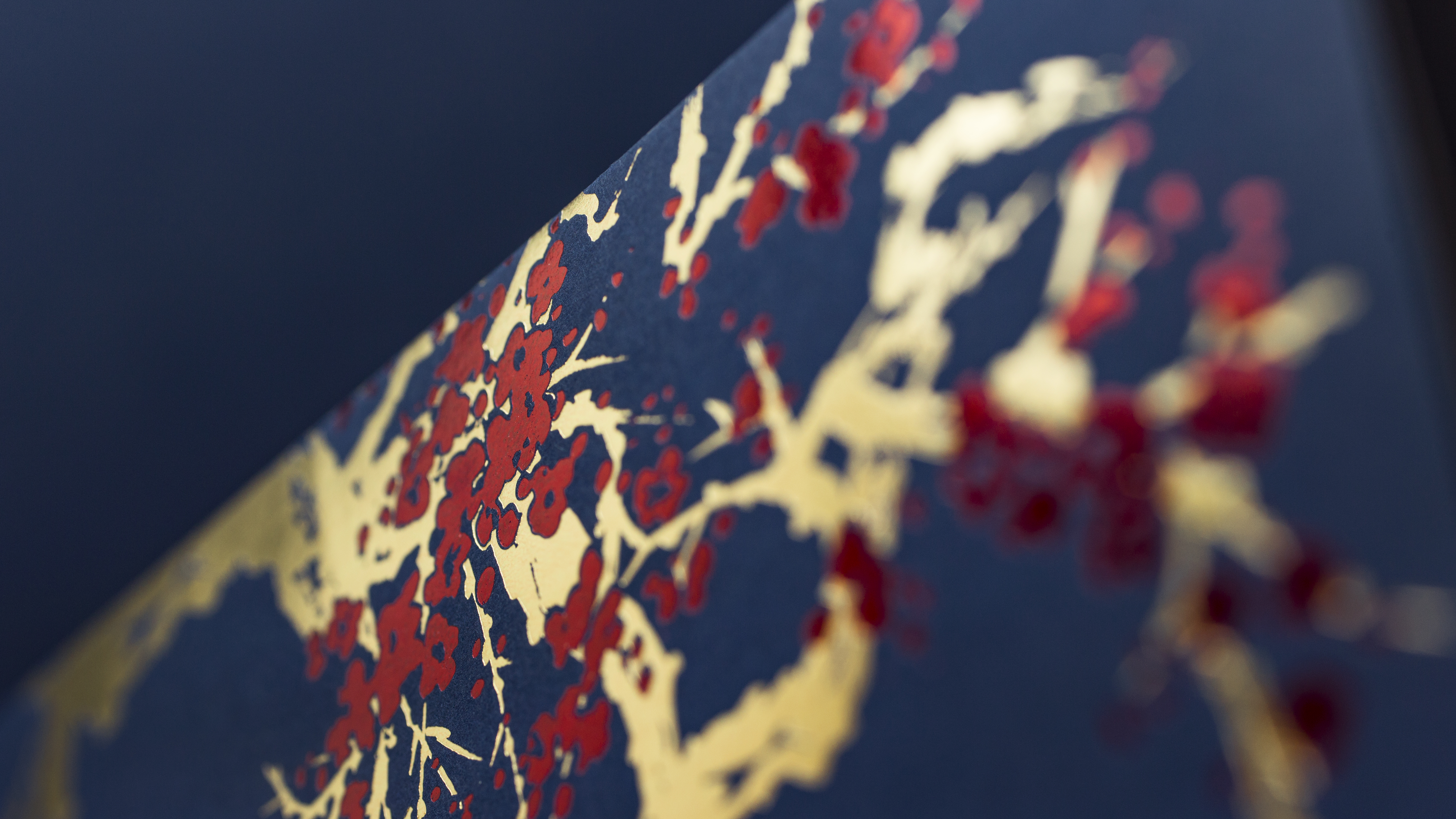
Design studio Sweety & Co.’s brief for MH Handmade Memories was to create a high end brand and packaging for their exclusive stationary items and luxury photo albums. The minimalist look and two colours evoke feelings of warmth and good taste and the hot stamping amplifies the exclusivity of the brand.
Image by Sweety and Co
Hudson Made NY
The philosophy behind Hudson Made NY, according to founder Bill Hovard, is to return to a time where craftsmanship and quality were valued above over consumption and standardisation, offering one of a kind products that perform well and that last. The beautiful packaging that envelopes these products is hand stamped letter pressed in one colour using clean well laid type on coloured card and evokes a feeling of pride and assurance.
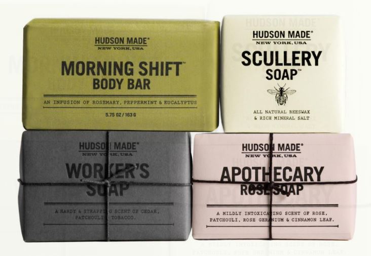
Image by Hudson Madeny
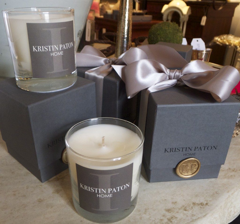
Kristin Paton Candles
Kristin Paton is a renowned interior designer based in London and Boston and is known for her modern, elegant and stylish interiors. She launched her own range of candles and the beautiful box packaging combines all these elements to portray a luxury and exclusive product that will appeal to the senses. The textured paper and seal on the box exudes style and elegance reminiscent of roman times.
Image by Kristinpatiointeriors
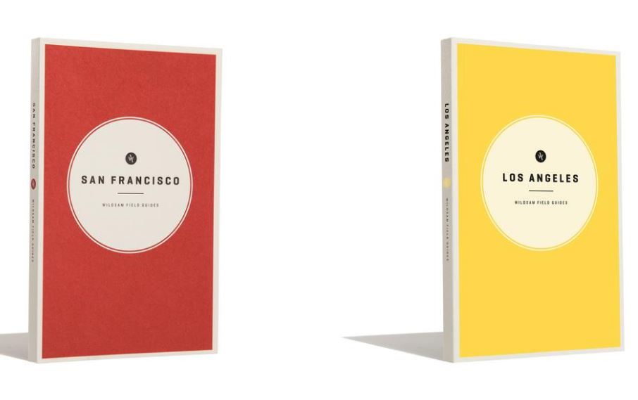
Wildsam Field Guides
The sixth entry on to our fave list is also designed by Stitch and Co (and is not technically packaging, but is such a beautiful use of paper that we couldn’t help ourselves). These field guides are the perfect example of how the cover of a book can speak to you from straight off the shelf. Founded in 2012, Wildsam’s aim was to point travellers towards unforgettable experiences. Through the guides they document a place through its stories with hand drawn maps, memoirs and historical anecdotes.
Image by Wildsam
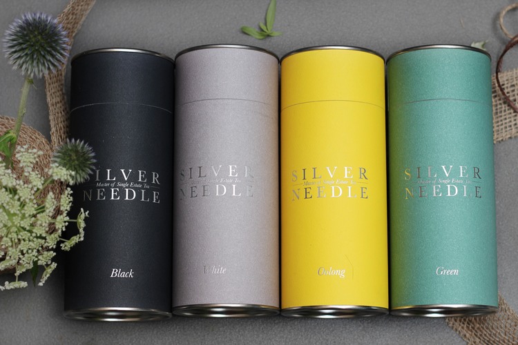
Silver Needle Tea Company
We are a nation of tea drinkers, there’s no denying it. So when it comes to gifting we’re always going to love some real tea. The Silver Needle Tea Company has designed a beautiful gift set of four tea tins that would make you want to reach for the kettle, teapot and cosy. These tins are clad in a quality textured card in four classic colours with text hot stamped across the front in silver.
Image by Silver Needle Tea Co.
Desig de Sant Joan
Our second chocolate packaging design entry, these handmade chocolates by Desig de Sant Joan deserved packaging that reflected the style, elegance and luxury of the product inside. We especially love the use of laser cutting techniques on the trellis lid and inside to house the chocolates themselves. The textured two coloured card and complicated creasing make the opening experience a delight. A great example of how well thought out packaging delights every step of the way.
Image by Desig-de-Sant-Joan
Artifact Skin Co.
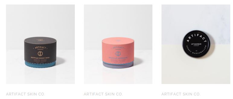
Artifact Skin Co. is known for their masques which are hand made in small batches and infused with essential oils and highest quality ingredients. The masques are packaged in white glass jars enclosed in sun-washed coloured paper tubes with a minimal sea and voyage inspired design. According to their website the designs are drawn from the concept of floating buoys that have “drifted a long way overseas and have set ashore – these ‘artifacts’ carry with them stories and maps of their discoveries.”
Image by Artifact Skin Co.
Get Well Remedy Kit
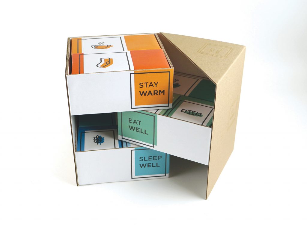
This packaging design ticks all the boxes, excuse the pun, in terms of it being modern, fresh, innovative and re-useable. There’s clever use of a variety of print and cut techniques including digital print, hot stamping, mix of plain card/paper and laser cutting. The unique design means it can also be repurposed as a desk tidy. We think it’s a well thought out and executed design.
Image by Tammy Kit
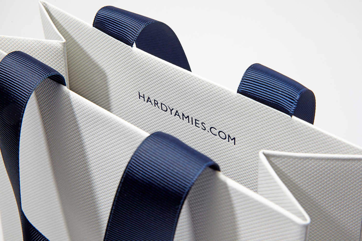
The Senses collection offers varying weights that can be bespoke embossed at our artisan paper factory.
Choose up to 13 different textures including Linen, Stripe, Leather and more.
For more information on our textured options and how to order call us today on +44 (0)203 9600 442.


Previous post
How the Sense of Touch Influences Luxury Packaging
Next post
Connect with colour for unforgettable results